Features
UK energy consumption: interactive infographic
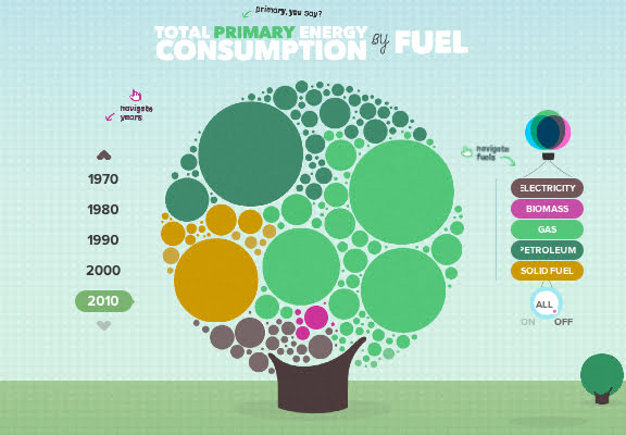
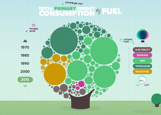
Regular readers of Blue & Green Tomorrow, and indeed followers of our infographics, might have seen our UK energy consumption infographic last month.
We looked at how it had changed between 1970 and 2010, breaking the charts up into sectors and energy sources using Department of Energy and Climate Change statistics.
And it seems that solar panel specialist EvoEnergy has had a similar idea, after coming up with an interactive energy consumption guide based on the exact same dataset.
It’s a very attractive graphic, and allows users to click on various places to see different nuggets of information.
.")
The UK Energy Consumption Guide. (Click for infographic).
Andrew Burley, EvoEnergy regional manager, said the infographic “is designed to make analysis and education about energy consumption simpler.”
He added, “Our hope is that everyone in the UK will now be able to gain a better understanding of how our energy consumption has changed over the last 40 years and what we can learn from it to benefit us in the future.”
The infographic can be viewed by clicking on the image above, or by following this link.
Further reading:
UK energy consumption 1970-2010: infographic analysis
UK renewable energy generation 2010-2011: infographic analysis


Green Home Improvements to Improve Accessibility for Persons with Disabilities

Solar Power Breakthrough Creates a Future Powered by the Sun

Should Green Influencers Use Alua To Build a Fan Club?

Jinko Solar’s Charitable Contributions Across the US

Your Dream of Having an Eco-Friendly Bathroom Is Within Reach

5 Ways Environmentalists Can Reduce Food Waste

A Look at Eco-Friendly Electric Semi-Trucks in 2024

Minimizing The Environmental Impact of Disposable Masks

Suneet Singal Discusses the Use of Sustainable Aviation Fuels

The Link Between Sustainable Farming & Biodiversity
Jinko Solar’s Charitable Contributions Across the US
Solar Power Breakthrough Creates a Future Powered by the Sun
Should Green Influencers Use Alua To Build a Fan Club?
Green Home Improvements to Improve Accessibility for Persons with Disabilities

 Features10 months ago
What is the Eco-Friendliest Option to Wash Your Dishes?
- Environment12 months ago
Building a Career in Green Construction: Tips and Insights
- News11 months ago
5 Ways Fleet Maintenance Software Can Help Businesses Be More Eco-Friendly
- Features10 months ago
Addressing Pressing Ethical Concerns with Crypto Exchanges