Features
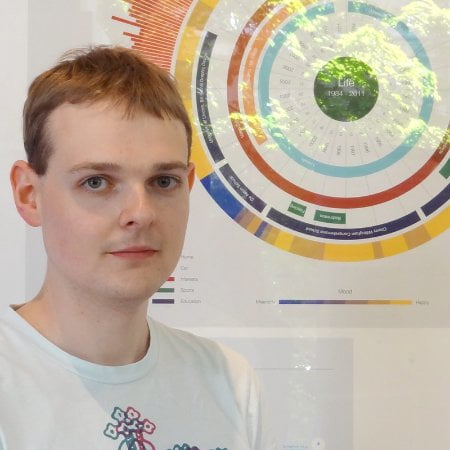
The man behind the infographics
We’re firmly of the opinion that a well-designed, well-informed infographic can, in some ways, get across information better than the written word. And the man behind Blue & Green Tomorrow’s array is Ben Willers.
Since joining us in January this year, Ben has produced infographics on an array of subjects, including UK renewable energy generation, pollution and waste in local authorities and the Pacific Island nations that are fighting a losing battle against climate change.
He also played an integral part in our Green Investment Bank HQ series, in which produced a recommendation of where it should be located, based on a number of important factors. This is on top of having infographics published in each of our last three in-depth reports, on limitless clean energy, sustainable tourism and sustainable investment.
Ben’s data visualisation brilliance led him to receive an award by David McCandless last year and to be longlisted at this year’s Information is Beautiful Awards. And the best part is that two of his recognised pieces were exclusively designed for Blue & Green Tomorrow.

 Regular visitors to our site will have seen us launch our first round of crowdfunding recently, to help fund our next three in-depth reports on sustainable investment, ethical retail and responsible media. In pledging to our cause, individuals will receive rewards based on how much they give us. And everyone who pledges £10 or more will receive an exclusively-designed postcard-sized infographic, made by Ben himself.
To find out more, visit our Sponsume page.
We drew back the curtain on Ben (not that we hide him behind one) and caught up with him to find out more about his career and the power of a good infographic.
Where does your love for data visualisation stem from?
I remember reading Information is Beautiful by David McCandless in the gift shop when visiting the Nottingham Contemporary in April 2010, several months before I began my MA and before I had decided what I was going to study. I remember thoroughly enjoying it and I guess it left a lasting impression.
Two of your pieces of work for B> were longlisted at this year’s Information Is Beautiful Awards. Why did you choose to enter each one?
I felt the stories they communicate are really interesting and reveal a lot about how the UK and the world in general has altered over the past three or four decades. Both contain a lot of complex data and reveal patterns that are only highlighted when presented visually.
How did you go about creating the World of CO2 infographic? What was the process?
It is fairly common knowledge that China is the most polluting when it comes to CO2 emissions, but the US is worse per capita. I wanted to explore how these countries compared to the rest of the world and also how trends have changed over time.
And the energy consumption infographic?
I stumbled across this data and immediately wanted to understand it better, so I began assembling a series of charts I quickly made in Excel, then compiled them together into one document and developed it from their.
What makes a good infographic in your eyes?
The goal must be to enlighten the viewer to see something that was not visible before. I prefer it when the reader is provided with an opportunity to identify these patterns themselves, rather than being told what we should be looking for, or how this data should make us feel.
Show us some of your favourite infographics from around the world, and explain why they’re your favourites.
This piece by Michael Deal visualises all the important information from the 2010 World Cup. Each 90 minute match is unique is its own way and I could spend hours comparing the different play styles.
I also like this piece from Nathan Yau which looks at vehicles involved in fatal crashes. It is immediately understandable and the findings are different to what I expected, with fewer accidents in the winter months.
You won an award last year from David McCandless, a real guru in the infographic scene. How did that come about and how did it feel?
I heard about the competition on Twitter, we were asked to visualise the financial crisis in Europe. I tried to make this complex subject as simple as I possibly could and learned quite a lot myself during the process. Having my work featured on a site like that was great!
What was the first infographic you made?
I made a timeline of when certain companies were founded over the last two centuries, it was quite interesting to see how long some like Nokia and IBM have been around.
Any tips for aspiring data visualisers?
Always assume your audience is highly intelligent, but lacking in knowledge of the subject you are covering.
What are you currently working on?
A piece for Al Jazeera which examines how much money has been raised and spent in the run up to the presidential election in the US.
Your work was exhibited in Paris earlier this year. You must have been pleased with that?
It was really great to have work featured in the same place as many other well known and respected designers!
Finally, what impact can a good infographic have on a reader?
They can place a new perspective on things and sometimes reveal things we weren’t even looking for. Of course sometimes they just look really cool!
You can follow Ben’s work by visiting his website and his blog, and by following him on Twitter.
Further reading:


Half of UK offices send furniture to landfill. Why is nobody talking about it?

Why Starting a Green Business as an LLC Makes Sense

Eco-Friendly Kitchen Deep Cleaning Tips for a Healthier Home

Ananeva’s Research Shows Arctic Ships Don’t Need Icebreakers

Repairing, Replacing, or Upgrading Windows for Sustainability

Are 4-in-1 Taps Worthwhile for Eco-Friendly Homes?

Pedestrian and Bicycle Accidents in Chicago’s Crowded Urban Areas

Neel Somani Discusses the Energy Market Design and How Pricing Actually Works

Eco-Friendly Landscaping: How Homeowners go Green Outdoors