Features
UK energy consumption: interactive infographic
Regular readers of Blue & Green Tomorrow, and indeed followers of our infographics, might have seen our UK energy consumption infographic last month.
We looked at how it had changed between 1970 and 2010, breaking the charts up into sectors and energy sources using Department of Energy and Climate Change statistics.
And it seems that solar panel specialist EvoEnergy has had a similar idea, after coming up with an interactive energy consumption guide based on the exact same dataset.
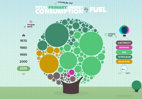
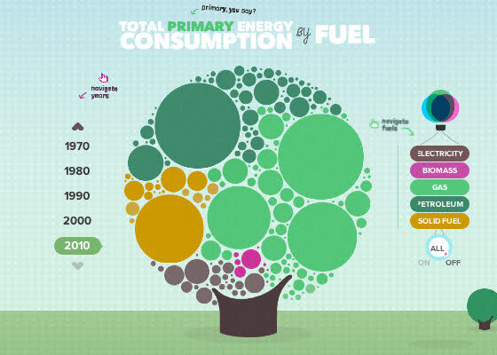
It’s a very attractive graphic, and allows users to click on various places to see different nuggets of information.
.")
The UK Energy Consumption Guide. (Click for infographic).
Andrew Burley, EvoEnergy regional manager, said the infographic “is designed to make analysis and education about energy consumption simpler.”
He added, “Our hope is that everyone in the UK will now be able to gain a better understanding of how our energy consumption has changed over the last 40 years and what we can learn from it to benefit us in the future.”
The infographic can be viewed by clicking on the image above, or by following this link.
Further reading:
UK energy consumption 1970-2010: infographic analysis
UK renewable energy generation 2010-2011: infographic analysis


Future-Proofing the Sustainable Workplace: Integrating Solar PV and Smart EV Infrastructure

Why Outdoor Offices Are the Future of Sustainable Work

How Eco-Conscious People Can Find Careers in Healthcare

Early Environmental Education Helps Children in Extrodinary Ways

Half of UK offices send furniture to landfill. Why is nobody talking about it?

Why Starting a Green Business as an LLC Makes Sense

Eco-Friendly Kitchen Deep Cleaning Tips for a Healthier Home

Ananeva’s Research Shows Arctic Ships Don’t Need Icebreakers

Repairing, Replacing, or Upgrading Windows for Sustainability

Are 4-in-1 Taps Worthwhile for Eco-Friendly Homes?
Half of UK offices send furniture to landfill. Why is nobody talking about it?
Early Environmental Education Helps Children in Extrodinary Ways
How Eco-Conscious People Can Find Careers in Healthcare
Future-Proofing the Sustainable Workplace: Integrating Solar PV and Smart EV Infrastructure
Why Outdoor Offices Are the Future of Sustainable Work

 Environment11 months ago
Small Choices, Big Impact: Cutting Your Daily Carbon Footprint
- Features9 months ago
Top Agricultural Stocks to Watch
- Features11 months ago
Breathing Easy: How Pool Chemicals Affect Lung Health And Safety
- Sustainability9 months ago
Sustainable Travel in Christchurch: A Greener Way to Explore