Features
7 Basic Types of Forex Charts Ethical Investors Must Understand
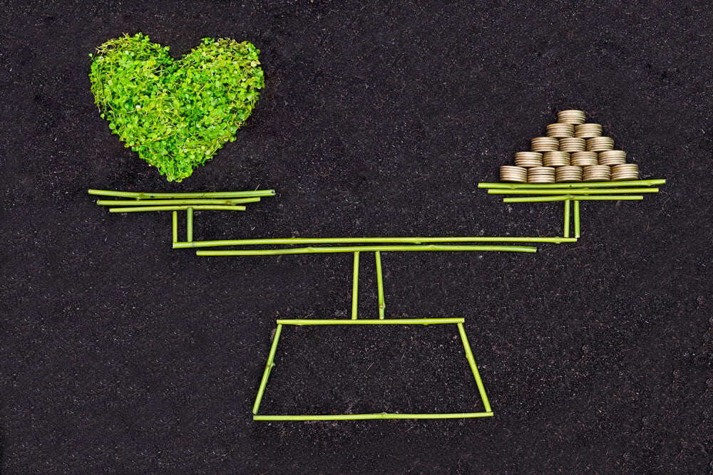
Are you passionate about being an ethical investor? There are a lot of ways that you can grow your portfolio without focusing on securities that are bad for the environment or human rights.
One of the best ways to be an eco-friendly and ethical investor is to invest in forex. The forex market focuses entirely on buying and selling currencies, so you don’t have to worry about purchasing assets that are going to be bad for the environment or invest in companies that engage in inhumane labor practices.
However, in order to become an ethical forex investor, you need to understand the ropes. You need to know how to balance your investing goals with your focus on sustainability. This means learning to read charts. Read forex brokers review to learn more about forex trading and stock market.
Reading Charts as an Ethical Forex Investor
Forex charts visualize the trading activity that takes place during a certain trading period. These periods can be selected in the trading terminal based on your strategy. What can also be selected in the terminal is the chart mode. You need to understand how to read them properly as an ethical investor.
In this guide, we’ll be covering 7 charts. But if you want to learn about these and other types of charts, head over to the Forex charts guide.
1. Japanese Candlestick Chart
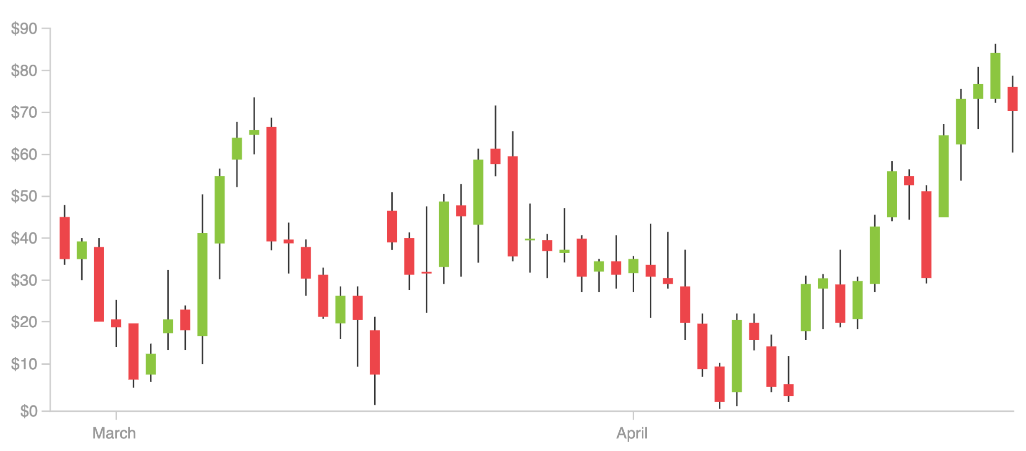
A Japanese Candlestick chart shows the market’s open, high, low, and close prices. Here is what the components of a candlestick mean:
- Real body – This is a wide part of a candle. It shows the price range between the open and close for the day. If the close was higher than the open, it’s colored green (or empty in some versions). If the close was lower, it’s colored red (or black).
- Shadows or wicks – These elements represent the high and low prices on a given day. If the shadows are very long in both directions, it means the prices varied significantly. If they are short, it means the highs and lows weren’t much different from the close price.
Candlesticks are very visual in how they highlight the difference between the open and the close. This makes them a great method for quickly assessing the sentiment and overall trend.
2. Heikin Ashi Chart
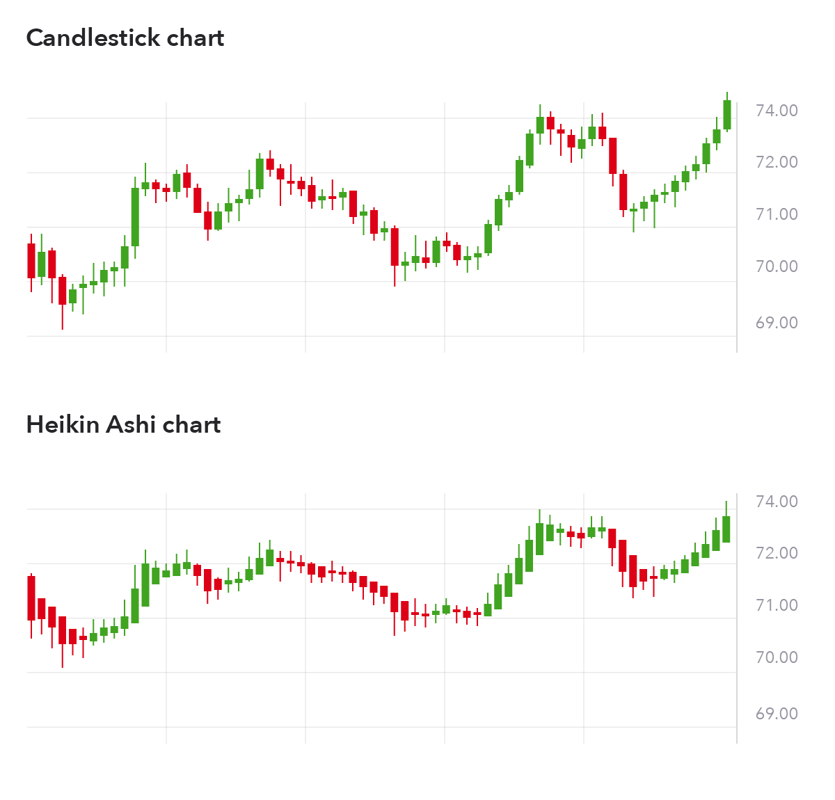
Heikin Ashi candlesticks are a variation of traditional Japanese candlesticks. The difference is that HA candles start from the middle of the previous candle rather than from the level where the previous one closed.
HA charts show average price moves giving the prices a smoother appearance. But the downside is that information is averaged, hence less accurate.
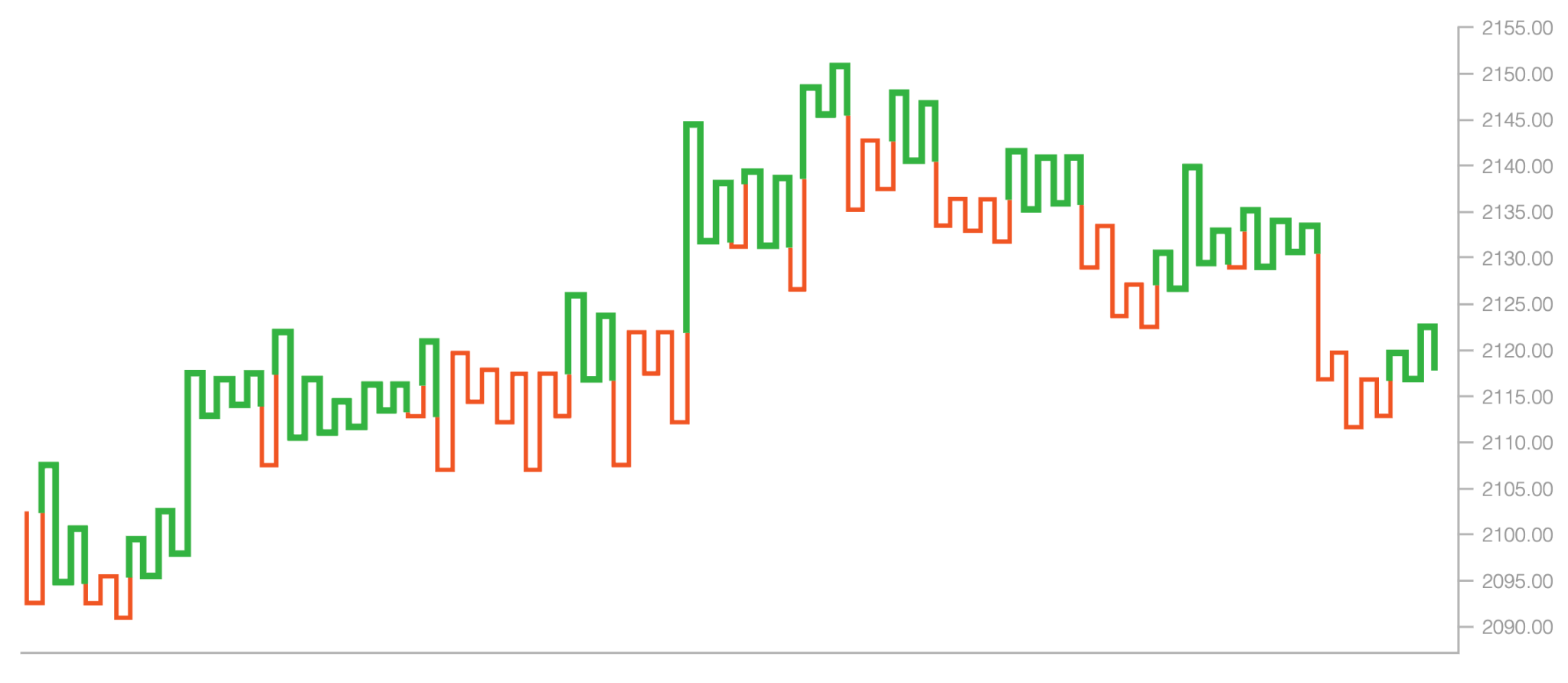
3. Bar Chart
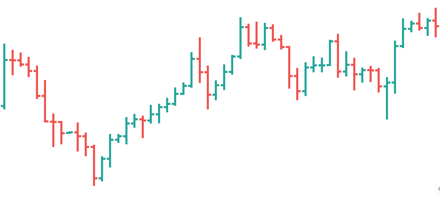
The bar in a bar chart is drawn as a vertical line, and here are the elements you need to pay attention to:
- The top represents the high price of the period.
- The bottom represents the low price.
- The horizontal line on the left shows the opening price.
- The horizontal line on the right shows the closing price.
Together, they all show all key components – the open, high, low, and close, or OHLC.
Bearish bars, the ones that closed lower for the period, are red. Naturally, bullish bars that closed higher are green. Large-range bars imply that the trading action is currently fast and furious.
4. Line Chart
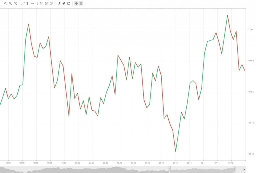
This is the most basic and simple price representation. If you ever looked at a regular graph, such as some sort of statistics, you should be familiar with the concept.
Line charts only depict the closing prices of currency pairs or any other assets. It marks price points on the chart and draws a line, connecting them. Just like with other types, green areas represent bullish movement, red areas – a bearish movement.
These charts don’t show complex information like opening or highest/lowest prices. If your strategy requires this knowledge, go for another chart mode. But if a simplistic representation is enough, bar charts will do.
5. Point and Figure Chart
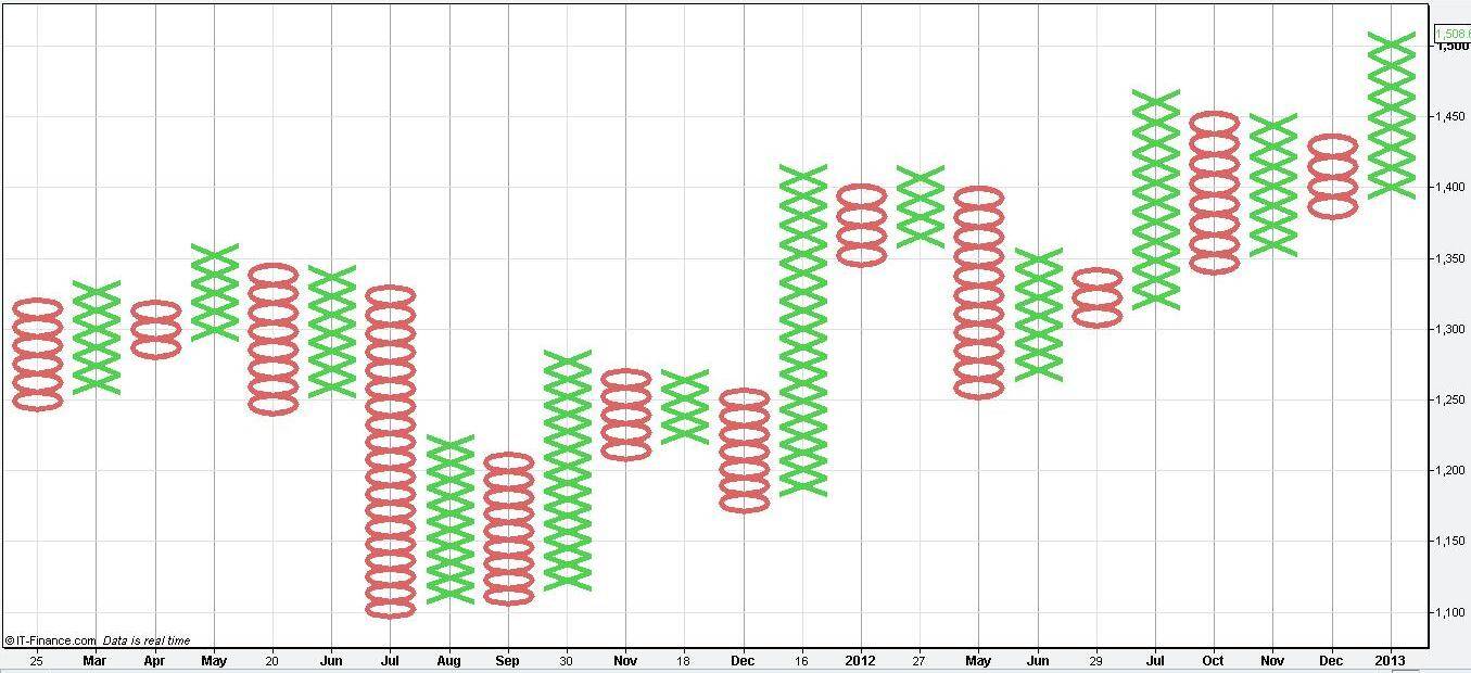
Point and Figure charts consist of stacked columns – Xs or Os – representing a specific amount of price movement. P&F charts establish a unit of price, which is used to measure movement. An X appears when the price rises by one unit, and an O appears when it falls by one unit.
This system monitors supply and demand and is only helpful for long-term traders. It eliminates time and filters out tiny price movements, sometimes to a fault. Plus, it can be very confusing for newbies.
6. Renko Chart
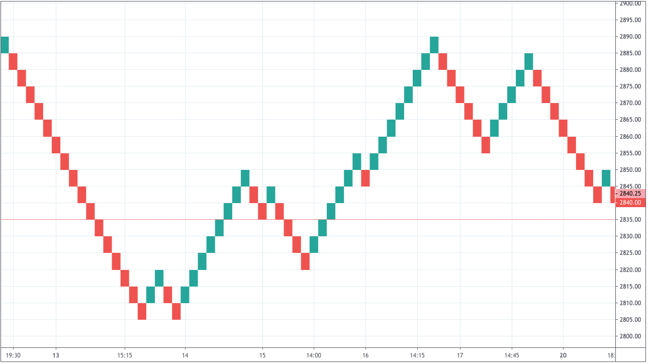
A Renko chart is made up of bricks that are never beside each other. They only move up or down at a 45-degree angle.
This chart also uses the concept of units or sizes. For example, you can set the size to $0.75. A new brick will form only if the price moves by two sizes in either direction – i.e., by $1.50. If the price declines $1.50, the chart will add a red brick, and if it rises – a green brick.
7. Kagi Chart
Kagi charts are helpful in figuring out entry and exit points. They also don’t represent prices in the context of the time – just price movements. Here is a short overview of the information this chart provides:
- The line becomes thick when the price reaches a new high – a buy signal.
- The line remains thick if the following closes are higher – a buy signal.
- The line becomes thin when the price forms a new low – a sell signal.
- The line remains thick until the price raises from the previous low – a sell signal.
The last three types of charts are used less frequently. Some find them hard to read, others prefer to have more information. But at the end of the day, the decision is yours – choose any type that suits your trading style. Besides, you can always try them out and switch whenever you like.
Know How to Read Forex Charts as an Ethical Investor
There are a lot of things that you need to keep in mind as an ethical investor. One of the skills that you need to master is learning to read charts. The seven charts listed above will help considerably.


Future-Proofing the Sustainable Workplace: Integrating Solar PV and Smart EV Infrastructure

Why Outdoor Offices Are the Future of Sustainable Work

How Eco-Conscious People Can Find Careers in Healthcare

Early Environmental Education Helps Children in Extrodinary Ways

Half of UK offices send furniture to landfill. Why is nobody talking about it?

Why Starting a Green Business as an LLC Makes Sense

Eco-Friendly Kitchen Deep Cleaning Tips for a Healthier Home

Ananeva’s Research Shows Arctic Ships Don’t Need Icebreakers

Repairing, Replacing, or Upgrading Windows for Sustainability

Are 4-in-1 Taps Worthwhile for Eco-Friendly Homes?
Half of UK offices send furniture to landfill. Why is nobody talking about it?
Early Environmental Education Helps Children in Extrodinary Ways
How Eco-Conscious People Can Find Careers in Healthcare
Why Outdoor Offices Are the Future of Sustainable Work
Future-Proofing the Sustainable Workplace: Integrating Solar PV and Smart EV Infrastructure

 Environment11 months ago
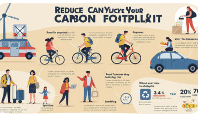
Small Choices, Big Impact: Cutting Your Daily Carbon Footprint
- Features9 months ago
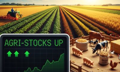
Top Agricultural Stocks to Watch
- Features11 months ago
Breathing Easy: How Pool Chemicals Affect Lung Health And Safety
- Sustainability9 months ago
Sustainable Travel in Christchurch: A Greener Way to Explore