Features
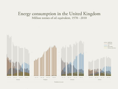
UK energy consumption 1970-2010: infographic analysis
A new Blue & Green Tomorrow infographic reveals just how much energy the UK has used, year-by-year, in the last four decades, but also examines how consumption has changed in each sector and the energy mix during the period.
The Department of Energy and Climate Change data shows that UK energy consumption peaked in 2001 and was at its lowest in 1982.
The 2001 peak level didn’t continue through the rest of the 21st century’s opening decade. Instead, it fell slowly to 2008, before dropping dramatically in 2009 and recovering slightly in 2010.
The use of solid fuels, such as coal and oil, has decreased significantly since 1970, as has the use of petroleum. Gas, meanwhile, has increased dramatically, and though the UK’s use of renewable energy has increased, it is at nowhere near the same scale. Nuclear peaked in the late ‘90s, before dropping off slightly in the 21st century.
.")
Energy consumption in the United Kingdom: Ben Willers. (Click to enlarge).
Looking in closer detail at the sector breakdowns, industry energy use has dropped by a substantial amount in the 40 year-period, but transport has shot up, which is unsurprising given the increase in vehicle numbers.
Both domestic and services use slightly more energy in 2010 than in 1970, with gas dominating the latter part of the timescale in both.
The fuel type breakdowns also uncover some interesting trends. For instance, the use of solid fuels had a significant blip in 1984—a lull that can be directly attributed to the miners’ strikes, which took place in 1984–85.
The energy gap left by the absence of coal was plugged by petroleum, which is extremely evident when focusing on the next chart along.
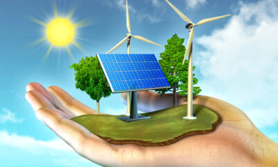
Perhaps the most disappointing aspect of the infographic is the comparatively small amount of energy that renewables contribute. Although it’s a growing industry, if we are to achieve a sustainable and green economy, it’s imperative that we push clean power to the forefront of our energy needs.
A recent infographic from B> highlights the UK’s renewable energy generation between 2010 and 2011, and another looks at renewable energy in Europe.
Further reading:
UK renewable energy generation 2010–2011: infographic analysis


Eco-Friendly Kitchen Deep Cleaning Tips for a Healthier Home

Ananeva’s Research Shows Arctic Ships Don’t Need Icebreakers

Repairing, Replacing, or Upgrading Windows for Sustainability

Are 4-in-1 Taps Worthwhile for Eco-Friendly Homes?

Pedestrian and Bicycle Accidents in Chicago’s Crowded Urban Areas

Neel Somani Discusses the Energy Market Design and How Pricing Actually Works

Eco-Friendly Landscaping: How Homeowners go Green Outdoors

Do You Need Solar Panels for Whole Home Battery Backup?

Collisions Involving Sudden Door Openings from Parallel-Parked Cars

Eco-Friendly Workplaces and Storm Attendance Challenges

 Energy11 months ago
Why Ireland Should Invest More in Solar Energy
- Environment12 months ago
Cool Your Home Naturally: Green Alternatives to Cranking the AC
- Environment9 months ago
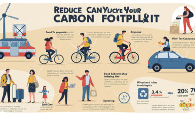
Small Choices, Big Impact: Cutting Your Daily Carbon Footprint
- Features10 months ago
Breathing Easy: How Pool Chemicals Affect Lung Health And Safety