Features
The World of CO2: infographic analysis
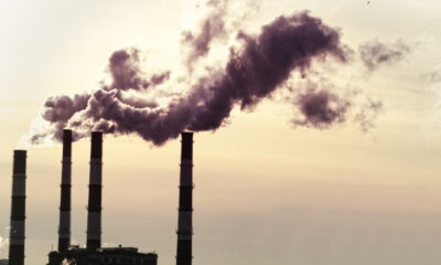
It’s widely agreed that two of the biggest environmental problems we face are pollution and waste. Tackling the former of the pair, a new Blue & Green Tomorrow infographic examines the world’s biggest polluters, and looks at how their emissions have changed over a 30-year period.
We have picked out the 18 countries that pumped the most carbon dioxide into the atmosphere in 2010 and ranked them in order of total emissions.
By using data from the US Energy Information Administration, we looked at the 30-year period leading up to 2010, to see if there was a trend in greenhouse gas emissions.
The current biggest polluter, China, has witnessed a meteoric rise to the forefront of the CO2 table, surpassing the former frontrunner, the US, in the mid-part of the last decade.
The US, meanwhile, has been a pretty consistent polluter, with third place India way behind the front two. Germany, in sixth place, is the only country in the top ten that has shown an overall decrease in emissions, whilst the UK is in 11th and its emissions have more or less levelled out over the period.
.")
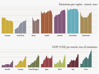
The World of CO2: Ben Willers. (Click to enlarge).
As you can see, we did two further rankings, based on emissions per capita and GDP per metric ton.
For the first of these two, China slips way down the leader board, and is replaced at the top by Saudi Arabia – the most polluting country per capita. The US retains its second spot, with Australia climbing up the ranking to occupy third.
The UK’s emissions per capita have decreased since 1980 – as have Germany’s.
Almost every country on the list has seen a rise for the third ranking, with France now leading the pack. In fact, it’s way out in front, meaning that its CO2-emitting industries are arguably the most profitable.
China is second to last in this category, whilst the US finds itself more or less in the middle.
The best thing to do with these in-depth infographics is to find out interesting trends for yourself, though, so we encourage you to grab a drink, sit down, and allow the data to seep into your consciousness.
After that, it might become startlingly apparent that whilst the infographic itself is beautiful, the data it displays certainly is not. If we’re to reach a sustainable future, we can’t carry on pumping dirty gas into the atmosphere.
That’s why adopting renewable energy and advocating sustainable investment are so important to the long-term sustainability of the planet.
Our job is to present the evidence that demonstrates the way we’re going currently simply isn’t sustainable. Your job is to act upon this, and make a difference.
Further reading:
Why our quality of life is being sacrificed by the continued use of fossil fuels
Infographic: renewable energy in Europe
Local and regional carbon emissions: infographic analysis
Swimming against the tide: the Pacific nations fighting a losing battle with climate change


Finding the Best Eco-Friendly Crypto Listing Agencies

Do Eco-Friendly Homes Sell Faster or Just Look Better?

A Breath of Fresh Air: Your Guide to Eco-Friendly Roofs

Eco-Friendly Home Upgrades That Start With Sustainable Tiles

Cool Your Home Naturally: Green Alternatives to Cranking the AC

Cutting Contamination Off At The Tap: Fighting PFAS At The Source

The Hidden Environmental Cost Of Your Grocery List

The Future of eBike Tech: What to Expect in the Next 5 Years

Eco-Friendly Sustainable Building Materials to Consider

Sustainable Driveway Upgrades for Everyday Homeowners
Cool Your Home Naturally: Green Alternatives to Cranking the AC
The Hidden Environmental Cost Of Your Grocery List
Cutting Contamination Off At The Tap: Fighting PFAS At The Source
The Future of eBike Tech: What to Expect in the Next 5 Years
Eco-Friendly Home Upgrades That Start With Sustainable Tiles
Do Eco-Friendly Homes Sell Faster or Just Look Better?
A Breath of Fresh Air: Your Guide to Eco-Friendly Roofs