Features
Local and regional carbon emissions: infographic analysis
How green is your area? You can find out using Blue & Green Tomorrow’s new infographic on local and regional carbon emissions per capita from 2009.
We’ve used data from the Department of Energy and Climate Change (DECC) to map the least and most polluting areas of the UK, as per their carbon dioxide emissions per capita.
We compiled two lists, named ‘saints’ and ‘sinners’ for the 50 worst and best local authorities or regions on the list.
So, without further ado, here are our findings:

Click to view
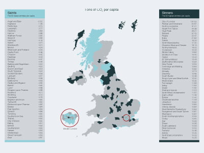
Local & Regional CO2 emissions 2009
As you can see, the best performing region is Scotland’s Argyll and Bute, which is the only remarkable area to have a negative per capita figure for its carbon emissions. This, according to Scotland’s Climate Change Declaration, is as a result of Land Use, Land Use Change and Forestry (LULUCF), which enables offsetting of carbon emissions through planting trees or managing forests.
Added to its relatively small population of just fewer than 92,000, and its disproportionately large area (nearly 7,000 km2) and it’s obvious why it performs so well. But it’s a great achievement, and one that should be praised.
On the other hand, perhaps predictably, the City of London tops the sinners list by quite some margin, with 127.52 tonnes of CO2 per capita.
Despite its dense population—11,700 people crowded into 2.9km2 at last estimate—huge impact from its industrial and commercial sectors and a massive commuting workforce vastly increase carbon emissions for the area.
At the bottom of the infographic is a breakdown of the top and bottom ten emitters across three sectors—industry and commercial, domestic and road transport—that aids with further explanation.
The City of London appears bottom of the industry and commercial section, with a huge 95% of its emissions attributed to it. It also appears in the bottom ten for road transport. But, it appears in the top 10 for domestic, with an impressive 1.72 tonnes of CO2 per capita.

Click to view
Change in CO2 emissions 2005 – 2009
We created an additional infographic that shows the change in carbon dioxide emissions from 2005 to 2009.
How much has your local authority improved or, dare we say it, got worse?
The message that emerges from both of these infographics is that further work needs to be done in order to curb greenhouse gas emissions. The scientific consensus is that human activities directly contribute to climate change.
“The world that we live in today is largely created by human beings, and we are human beings”, Christian Thal-Jantzen, an adviser at Bromige told B> last year. “Therefore, if we don’t like it and we think it should be different, we’ve got to act differently, and one way we can is by investing ethically.”
To do so, get in touch with your IFA. Or alternatively, fill in our online form and we’ll help you find companies and funds that go beyond reducing their impact on the environment, and actively help address climate change.
You can also reduce your carbon footprint dramatically by using 100% renewable energy at home. It’s a lot easier to make the switch than you might think; Good Energy will be more than happy to help.
Click here to read local authority reactions to the infographics.
Further reading:


Eco-Friendly Kitchen Deep Cleaning Tips for a Healthier Home

Ananeva’s Research Shows Arctic Ships Don’t Need Icebreakers

Repairing, Replacing, or Upgrading Windows for Sustainability

Are 4-in-1 Taps Worthwhile for Eco-Friendly Homes?

Pedestrian and Bicycle Accidents in Chicago’s Crowded Urban Areas

Neel Somani Discusses the Energy Market Design and How Pricing Actually Works

Eco-Friendly Landscaping: How Homeowners go Green Outdoors

Do You Need Solar Panels for Whole Home Battery Backup?

Collisions Involving Sudden Door Openings from Parallel-Parked Cars

Eco-Friendly Workplaces and Storm Attendance Challenges

 Energy11 months ago
Why Ireland Should Invest More in Solar Energy
- Environment12 months ago
Cool Your Home Naturally: Green Alternatives to Cranking the AC
- Environment9 months ago
Small Choices, Big Impact: Cutting Your Daily Carbon Footprint
- Features10 months ago
Breathing Easy: How Pool Chemicals Affect Lung Health And Safety